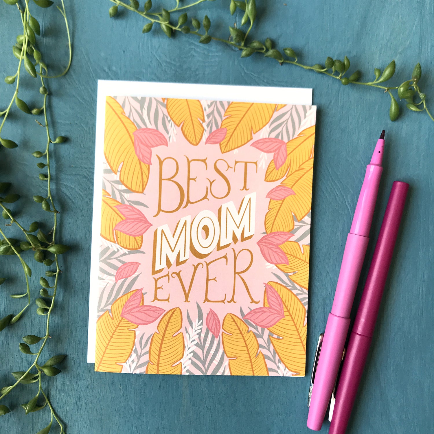
Your mother does so much. Treat her well this Mother's Day!
-
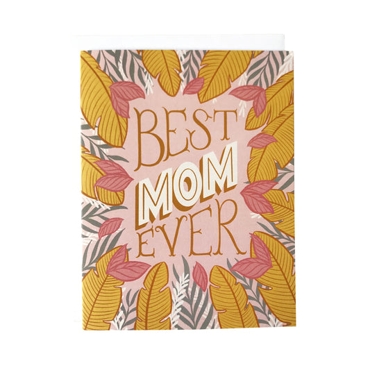
Best Mom Ever Mother's Day Card
Vendor:Carabara DesignsRegular price $7.00 CADRegular priceUnit price per -
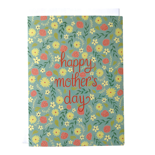
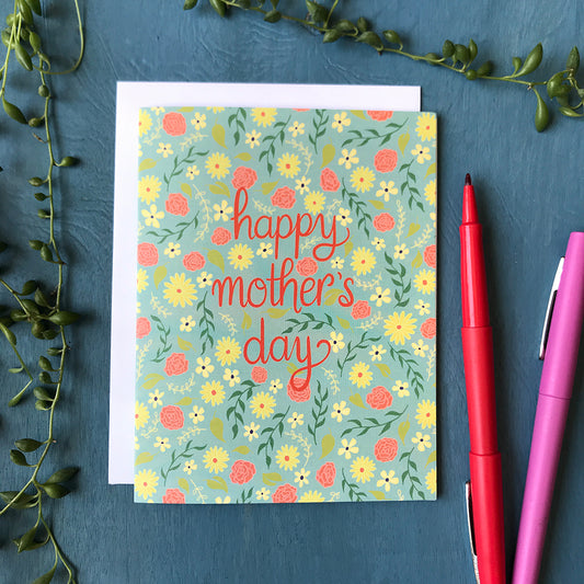
Mother's Day Floral Card
Vendor:Carabara DesignsRegular price $7.00 CADRegular priceUnit price per -
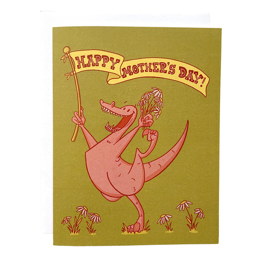
Dinosaur Mother's Day Raptor Card
Vendor:Carabara DesignsRegular price $7.00 CADRegular priceUnit price per -
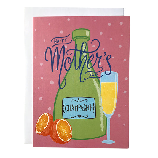
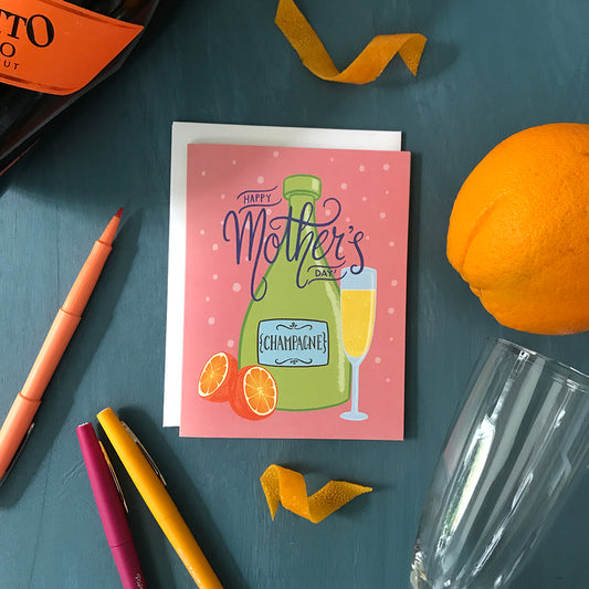
Mother's Day Mimosa Card
Vendor:Carabara DesignsRegular price $7.00 CADRegular priceUnit price per -
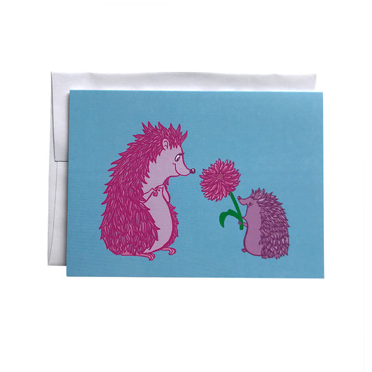
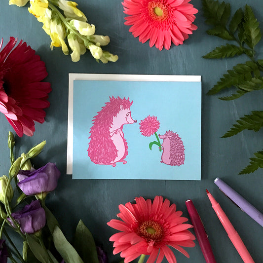
Hedgehog Flower Card
Vendor:Carabara DesignsRegular price $7.00 CADRegular priceUnit price per -
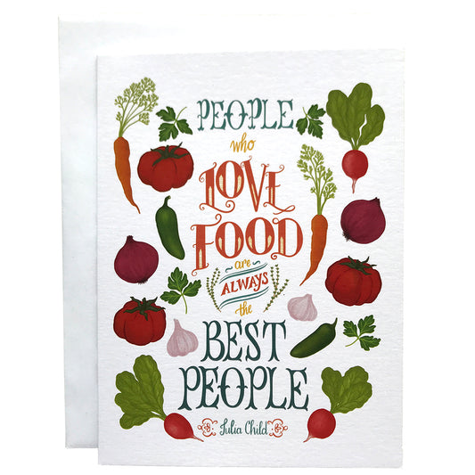
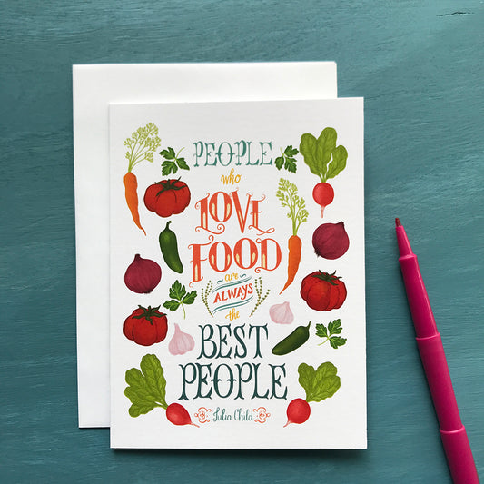
Foodie Quote People Who Love Food Any Occasion Greeting Card
Vendor:Carabara DesignsRegular price $7.00 CADRegular priceUnit price per -
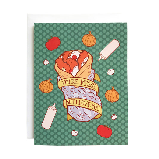
Messy Nova Scotia Donair Greeting Card
Vendor:Carabara DesignsRegular price $7.00 CADRegular priceUnit price per -
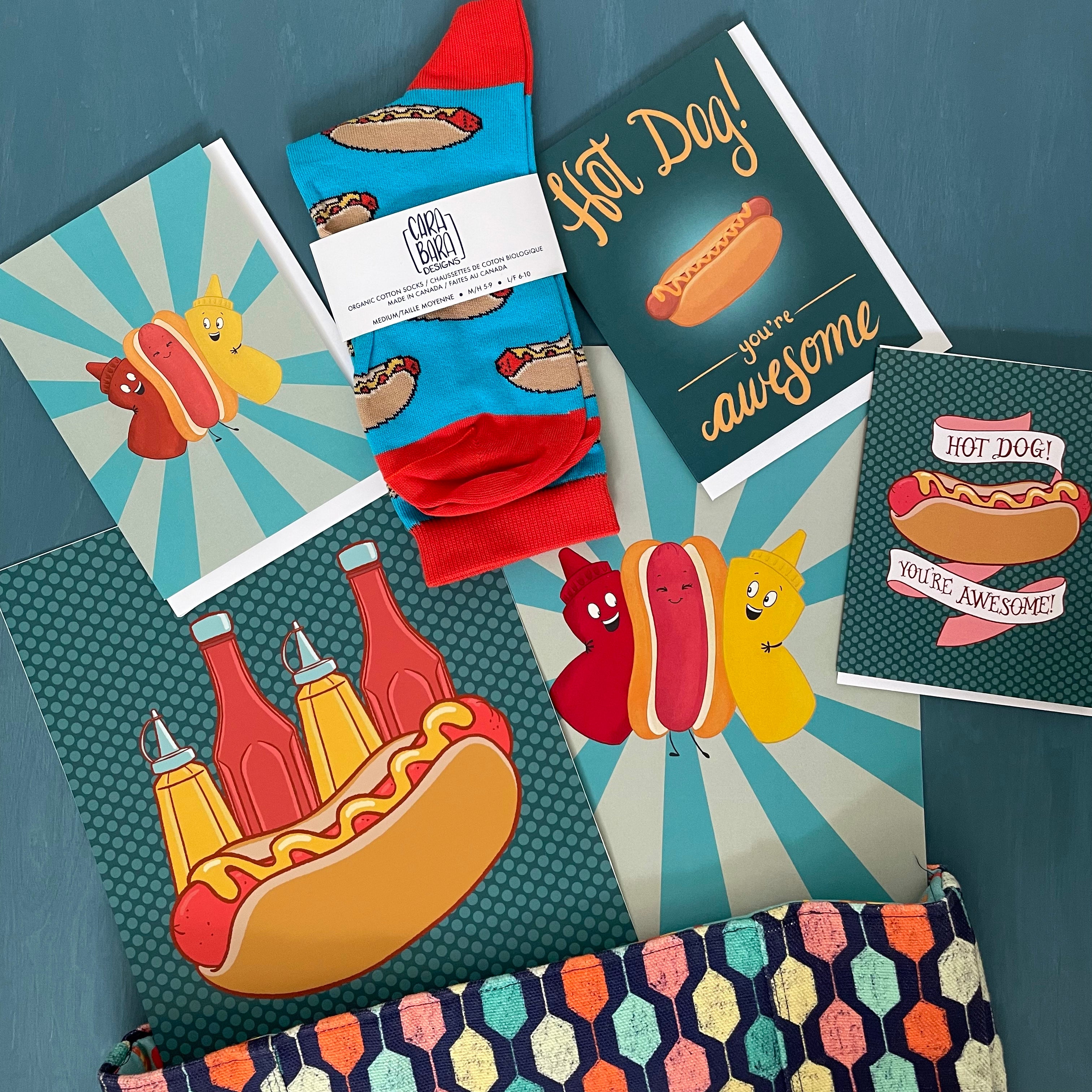
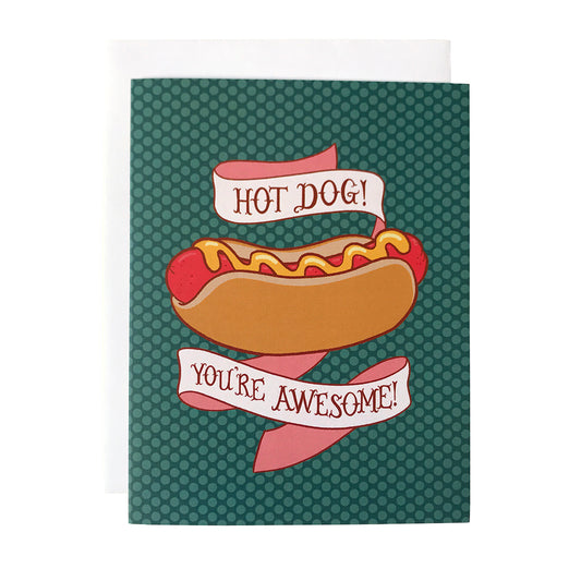
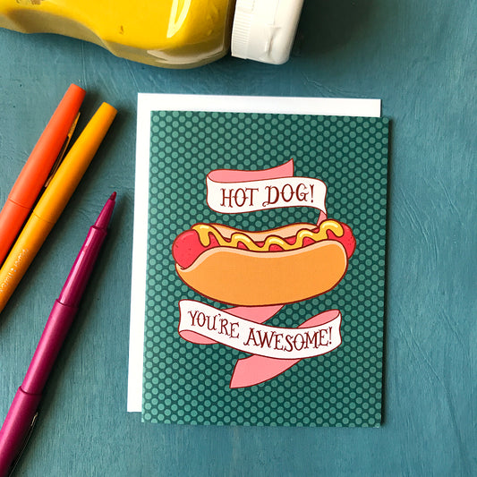
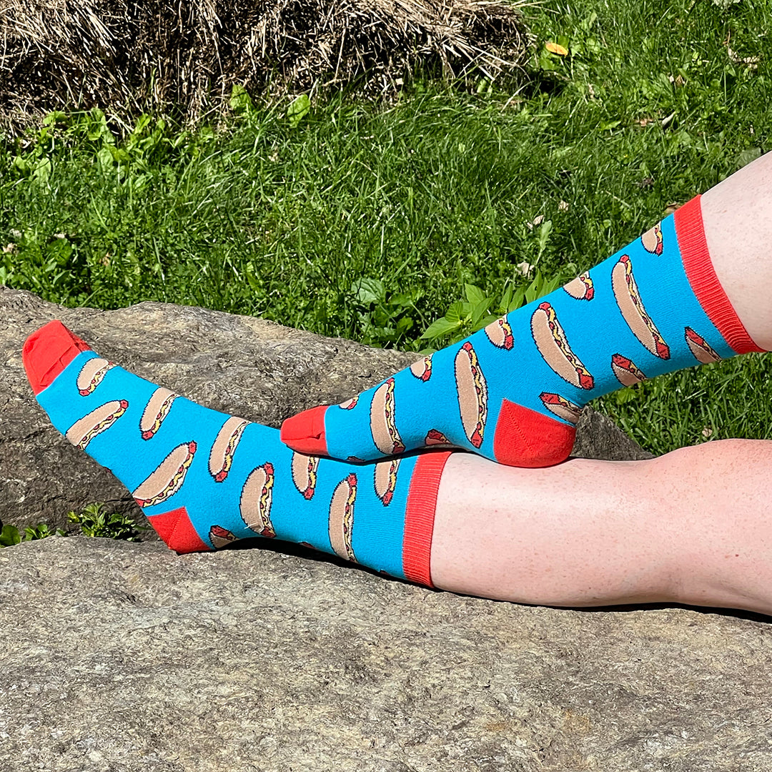
Hot Dog! You're Awesome! Greeting Card
Vendor:Carabara DesignsRegular price $7.00 CADRegular priceUnit price per

Close to home
Always Canadian-Made
How your products are made is just as important as how much you love them. All of our high-quality products are manufactured in Canada to reduce our environmental impact.
Always original
Designed with Love
Everything we sell is designed by us, for you. Whether you're giving a gift or treating yourself, we think personal touches matter.
say no to disposable
Committed to Quality
We've invested heavily in making sure that our products are manufactured to the highest standards. Our socks feature woven designs that last for years.